John Troy
  • Figures
    • More Figures
  • Landscapes
  • Portraits
  • Scenic
  • Student Work
  • Bio
  • Contact
  • Blog

Scrub on a Hill

5/25/2017

1 Comment

 
Picture
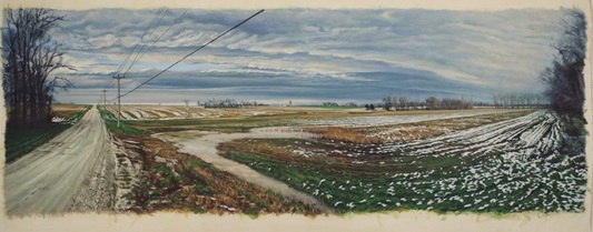
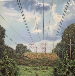
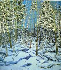
"Scrub on a Hill", oil on canvas, 36"x36"
My latest painting "Scrub on a Hill", attempts to literally upend the conventions of landscape painting by forcing a dynamic of vertical movement.  Landscape, by definition, infers a horizontal axis; hence, the computer matrix "landscape/portrait formats.
     But my objective in this painting is to move the viewer through and upward rather than across the space.  I first squared the composition in order to equalize the vertical and horizontal and then employed practically every pictorial device to emphasize the third dimension (depth) and upward thrust. 

These devices include linear perspective properties of scale and pronounced sight lines; atmospheric perspective properties of contrast and detail; drawing means of line, value and texture; and color properties of hue, value and temperature.  Additionally, I borrowed a landscape design device of compartmentalizing the space into "rooms" in order to enhance spatial movement.
The result is fairly quick movement from foreground, up and over the slight hill, and then reverse movement back and up to the clouds.  The movement is quick but the air is thick; a hot summer atmosphere.  This is the full, deep, relentless green of mid-summer: nothing like the broad color range of my usual late fall/early spring landscapes.  And this was the most difficult aspect of the painting.
PictureNeil Welliver, "Shadow"

Green paintings are the most difficult which is why there are so few of them.  The great landscape painters like Corot, Inness, and Welliver employed green very sparingly and never produced green paintings.  
The greatest painter of green, Henri Rousseau, created surrealistic dream-like images, capitalizing on green's psychological qualities.  This is the approach taken by Gillespie and Kelly more recently, which I have sometimes tried to emulate in some of my figure paintings.

Picture
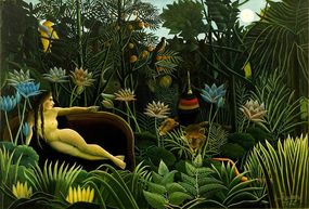
Henri Rousseau, "Dream"
Green is so difficult to depict, especially in direct observation, because it doesn't exist.  What we perceive as green is really variations of yellow and blue.  And those perceptions are determined by the type of red (orange, red, violet) next to it.  It is impossible to depict green with green pigment.

I am particularly happy with the title, "Scrub on a Hill".  I have an on-going argument with my colleague, Jacob Stanley, on the purpose of titles.  He believes in the importance of titles as qualifier while I insist their role be limited to identifier.  I am a strong believer that the image needs to stand on its own and is deficient if it needs to be "completed" with words.
Picture
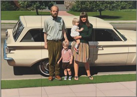
Robert Bechtle, "'61 Pontiac"
Titles should act as descriptions to aid in the identification of individual works: the exasperating "untitled", of course, should be avoided at all costs.  Perfect titles include "Ocean Park #24", "Woman II", and "'61 Pontiac".  
​Titles can be be evocative as long as the feeling/sensation is the same as the image and is not meant as an augmentation: see Richter's "January".

Picture
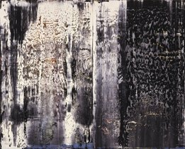
Gerhard Richter, "January"
Like "January", I think "Scrub on a Hill" is both descriptive and evocative. "Scrub" is such a great word!  In horticultural terms, it describes untended and unwanted growth, the detritus of man's interaction with the natural landscape.
That is very close to the underlying investigation (content) of all my landscape drawings and paintings.
​Descriptive indeed!

1 Comment

Hartley

3/18/2017

0 Comments

 
​"Hartley" represents the latest in my "homage" series of paintings.  It is a direct reference to Alice Neel's 1964 painting of her younger son, Hartley.  Mine is an oil on canvas, 40"x30",with my son, Murphy, in the title role. Most recently, I paid direct homage to Hans Holbein in "The Dead Christ".  Previously, my figure studies have directly referenced Gregory Gillespie, Thomas Eakins, John Kane, and Walt Kuhn.

"Direct reference" is not a euphemism for stealing: homage is not a passive and parasitic activity.  It is founded on a deep and immediate connection on the basis of form, content, and inspiration.  The first time I saw Walt Kuhn's "Roberto", I knew that he understood me: he wears my shoes when he paints.  Kuhn's ideas are worth revisiting through my eyes because our views of the world are so similar.

​For me, homage is not about style because neither is inspiration.  My major influences run the gamut of aesthetic approaches, including Surrealists (Gillespie), Realists (Eakins), Naivists (Kane), and Abstractionists (Kuhn).

Neel has always been a favorite painter of mine and an inspiration, partly because I see her as the patron saint of Late Bloomers: she did not achieve broad success and recognition until well into her 50's. There might still be hope for me.

I met Neel in the mid-70's when she visited the Painting program at Washington U, acclaimed then as a national treasure and looking every bit like the sweet old Granny of her infamous self-portrait; only clothed.  The sweet old Granny regaled us all afternoon with stories of her bohemian lifestyle in mid-century New York including, multiple affairs, scandals,and even brushes with the law.

Neel's life was trying at best and I don't equate my life experiences with her's.  What I admire and respect is her determination and commitment to her painting ideals in spite of life's adversities: her tumultuous love-lives, getting caught up in the Red-Bait scare of McCarthyism, being a welfare mother raising two sons, and the emotional costs of losing two daughters; one to an early death and one to parental kid-napping.

I also admire Neel's ability to instill in her subjects an animated humanity; a gestural physicality demanding our responce.  As in all of her portraits, Neel's "Hartley" transcends the character of the individual to address the subject in universals.

Some people refer to any image of a figure as a portrait. That, of course, is incorrect.  A portrait attempts to express uniqueness of the individual; to say something about the character of the person through examination of carriage and appearance.  Most figurative work, on the other hand, is about universals: the image of the figure representing an aspect of the human condition - a mirror to our collective soul.

​As a figure painter and a portraitist, I normally do one or the other; the universal or the individual.  Neel almost always manages to do both.  Eakins often accomplished both, as did Holbein: Sargent never did (he perfectly captured the individual without empathy).
​
Picture
"Hartley", 2017, oil on canvas, 40"x30"
Picture
Alice Neel, "Hartley", 1964, oil on canvas
Picture
"John Kane", oil on canvas, 48"x36"
Picture
John Kane, "Self-Portrait", 1929, oil on canvas
Picture
Alice Neel, "Self-Portrait", 1980, oil on canvas
Just as Neel's "Hartley" has always been read as the artist's son representing the universal "young man", so Murphy as my "Hartley" is more of a concept than a person.  There is a little personal Murphy there, but not much: he is meant to portray a type, a state of being.  It is my attempt at the individual/universal.

There are a number of conscious references in my homage to Neel's "Hartley.  Both Hartleys are the artist's younger son.  They are in the same pose.  They are attired in white T's and khakis which are both timeless and time-referenced.  There's a suggestion of Brancusi's Male Torso.  It is an obvious studio environment with studio chair, fabric, and homosote. It is the occasion of a child visiting the studio of a parent.
PictureEdgar Degas, "Manet in the Studio"
Not to make too much of it, but the painting tradition of a visit to an artist's studio is a reference to intimacy.  Whomever is visiting the studio is entering the artist's private domain and assuming some responsibility for the artistic output.  Think Degas' drawing of Manet, Madame Cezanne, and most of William Merritt Chase's oeuvre. 

​In this case, the parent/child relationship is reversed as Hartley is visiting the parent's studio in direct support of her/his professional objectives, a job usually undertaken by the parent.  But is a child's visit to the studio, even an adult child, ever really voluntary?  As in all parent/child intimacy, there is a subtext of obligation in Hartley's visit.

Picture
Paul Cezanne, "Madame Cezanne in a Red Armchair", oil on canvas, 1877
0 Comments

The Dead Christ

11/28/2015

0 Comments

 
Picture
"The Dead Christ",  16" x 72", oil on canvas,  2015
My latest painting, "The Dead Christ" is, obviously, an homage to the great Hans Holbein the Younger painting, "Body of the Dead Christ in the Tomb", oil and tempera on panel, 12" x 79", 1521-1522.  
Picture
 Holbein (active 1519 - 1543) is a Northern High Renaissance master of German descent, known primarily as the court painter of Henry VIII of England . Henry is the originator of the Church of England and Episcopalianism.  Holbein is the portrait painter of renown of Henry and the many wives and challengers (Sir Thomas Moore) he beheaded.
Holbein is the greatest humanist of the humanist Renaissance period, roughly 1350 - 1550 A.D., because his paintings and drawings represent the deepest insight into the human psyche through intense visual scrutiny.  Holbein is a precursor of the Realist movement of the 19th century which includes Frenchmen Gustave Courbet, Eduoard Manet, and Edgar Degas, and American Thomas Eakins, all of whom are followers of Holbein's uncompromising investigation into the essential visual truths of his subjects.
Holbein's dead Christ is dead: he depicts the reality of death in the same way that Courbet depicts the reality of a death in "A Burial at Ornans".  While Courbet represented the response to death, in Holbein, this is rigor mortis: not someone who is expected to raise in 3 days.  Holbein is protestant, removing all the glorious rapture and spiritual metaphor of Roman Catholic death.  Holbein shows us what happens to our bodies when we die: this is what, as a Realist concerned with what the reality of our existence on earth looks like, I respond to.
But my dead Christ is not about death - he is obviously alive. But, lying on a table on a white sheet, he is in a dead pose in a death environment; mortuary or necropsy.
Could it be about sacrifice?  Not divine Jesus-type sacrifice but day-to-day human-type sacrifice?  This is a guy puting himself (maybe not voluntarily) in the pose and environment of ultimate sacrifice, sacrificing one's self for the greater good of community, family, humanity.  I've always said my work is about the reality of being a young man (even as I am not so anymore).
Both painted environments are claustrophobic. The Holbein environment is meant to suggest a coffin.  Mine, utilizing a Sienese brocade drapery device borrowed from a 1450 painting by Giovanni di Paolo, "Coronation of the Virgin", represents a place that is other-worldly, not constrictive, an environment somewhere between the limitations of earth and the realm of redemption.  

0 Comments

Tracks

8/7/2015

1 Comment

 
Picture"Tracks" oil on paper 26" X 56"
My latest landscape painting, "Tracks", continues the investigation of how the character of the land is reflected in the remains of imposed activity - surface landmarks .  It is an idea akin to empathizing with a painted human subject through awareness of the material qualities of the individual, including those physical elements like wrinkles and laugh lines that denote effects of time and exertion: one of the purports of my figure painting.  
In "Tracks", multiple directional lines move us across the landscape in order to explore the topography intimately.  These lines are defined by natural (snow, cloud formations) and man-made (road, utility infrastructure) indicators, as well as a hybrid of the two (snow trapped in tire tracks).  The objective is movement through space and time to connect with the landscape experientially, as opposed to passively and statically.  Therefore, our understanding of the subject is expanded beyond mere appearance to include history and material singularities: the realities that make each subject truly unique. It is not a moralistic exercise on environmental stewardship: the objective is simply truth.

Pictureuntitled oil on paper 16" X 44"
In support of truth, there is something very unpicturesque in the Missouri landscape which is why it attracts me.  It is not unbeautiful; just more hardscrabble than Iowa, Virginia, and Pennsylvania, and, in its laugh lines and wrinkles, clearly evokes the challenges of time.

Picture
Rackstraw Downes, "Canal Homes at Bayou Vista" oil on canvas
Rackstraw Downes is the king of the scrutinized landscape and another of my heroes.  The man with the greatest name in art utilizes investigative painting to understand the nature of place.  Painting solely by direct observation, Downes "sees" in his subjects the kind of historical and psychological mining usually reserved for portrait painting.  Like Lucian Freud, who spent 75 hours a piece with his portrait subjects, the longer Downes spends with his subjects, the greater our connection with them.  He demands that the immediacy of his scrutiny take as long as  necessary which affirms its timelessness.
"As long as necessary" for Downes can mean weeks, months or even returning a year later when conditions are right to complete a painting.  In the canons of modern art, this is another great hallmark of the perfect fusion of content and methodology.
Picture
Rackstraw Downes "Behind the Store at Prospect" oil on canvas
1 Comment

The Acrobat

7/20/2015

0 Comments

 
Picture
"Flip" oil on canvas 36" x 36"
My latest painting, "Flip", is a very definite depiction of the concept of the acrobat.  All of my figure paintings since graduate school have made reference to the acrobat, whether the overt subject be an athlete like John Kane or a saint like John the Baptist: the acrobat is always implied through pose, attitude and bearing. 
Picture"John Kane" oil on canvas 48" x 36"
Saints and athletes are considerations of man at his positive pinnacles - morally for the saints and physically for the athletes.  Of course, in my Jesuit humanist training, achievement of both physical and moral perfection is the ideal - the convergence of Spartan and Franciscan philosophies. That is why these guys  are worthy of memorializing in paint; for while I am a realist in aesthetic temperament, I don't believe in the ordinary.  The reality of the driven is worthy of our scrutiny. 

Picture"St. John the Baptist" oil on canvas 48" x 24"
The acrobat, like the dancer and athlete, represents physical self-control for beneficial outcomes, but adds a bit of subversion suggesting something slightly untoward in its method: the acrobat asks the body to perform in quite unexpected and unnatural, yet titillating, ways.  Therefore, the acrobat is a universal symbol for the inversion and reversal of established order. Distinctly anarchic.  This is why the acrobat was a favorite subject for the modernist innovators like Degas, Picasso, Calder, and my beloved Walt Kuhn.  They saw a reflection of themselves in their subjects and wanted to be recognized for the same daring, dangerous sensibilities, a connection contemporary artists are loath to relinquish.

Picture
Walt Kuhn "Trio" oil on canvas
0 Comments

Man Horse Dragon Shield

6/16/2015

0 Comments

 
Picture"St. George". Bernardo Martorell, 1438
I was visiting the Contemporary Art Museum in Chicago in November when I came across a sculpture of St. George by Alexander Calder.  Calder had clearly abstracted the subject to it's essential elements; man, horse, dragon, and shield. As I wrote the four elements in my sketchbook, I experienced instantaneously an epiphany on Calder's interpretation of St. George and it's diagnosis of the human condition.  Man Horse Dragon Shield. Man Horse Dragon Shield.  Yes, this is the Human Condition.  I couldn't imagine another paring of words that better described our existence. I am not a wordsmith and do not normally gravitate to art that utilizes text: I'm trained as a visual artist and I communicate best with images, not text.  So I have been terribly surprised to be so deeply effected by a sequence of words.  For the first time in my professional life, I am responding emotionally to letterforms, not pictures. How could I turn into Barbara Kruger at this stage in life? 

Picture"St. George and the Dragon", Raphael, 1506
Because of my practically  visceral reaction to the words, I have been questioning my aesthetic ideas and production and I see that these words are clearly central to my oeuvre.  The "man" is the most obvious presence in my work whether represented by Max Schmitt, Marty Sheridan, Luke, or St. Anthony.  "Horse", "dragon", and "shield" are what define the "man" and his reality of existence: support, danger and defense. My paintings have always been about men responding to their nature: the reality of what they are.  Calder, through the metaphor of St. George, reduced that nature succinctly to its basic elements. When we strip away all the pretense and distractions in life, this is what we are left with: man horse dragon shield.  

Picture"St. George and the Dragon", Raphael, 1504
So how do I respond to this epiphany in artwork?  The four words resonate so deeply that I have to use them but I am trying to figure out how to employ words in my imagery without being cliche.  
In December, I had the opportunity to travel to Poland and visit the restored Stuttoff Concentration Camp near Gdansk.  It was a humbling and very emotional experience and the four words reverberated in my head: man, horse, dragon, shield - obviously, with an emphasis on the dragon.  Like so many before me I'm sure, I feel obligated to tell the stories of the people who suffered in that ordeal.  Below is my first attempt; a portrait of Klemens Kelch from his induction photo.  Man Horse Dragon Shield


Picture
"Klemens Klech", oil on campus, 20"x20"
0 Comments

"I am Sienese"

9/29/2014

0 Comments

 
PictureBartolemmeo Bulgarini, "the Assumption of the Virgin with St. Thomas Receiving the Girdle" 1360's
When my wife and I first travelled to Italy in the early 1980's, many people told me that we had to go to Siena: it was an aesthetic experience unlike any other. We were primarily committed to Rome because of my work with Tyler School of Art but we arranged a long weekend outside of Rome and chose Florence over Siena, because of Florence's obvious  influence on Renaissance art and philosophy.  I've never regretted that decision and Florence is, of course, not to be missed. 
But almost 30 years later, I had the opportunity to spend 24 hours in Siena and I was totally smitten.  As soon as I entered the first of the major civic museums, Palazzo Pubblico, I knew I was home.  The connection to my personal aesthetic and the works of the Sienese masters was immediate, overwhelming and only strengthened as I subsequently visited the Cathedral and Baptistry, the Pinacoteca Nazionale, and the Spedale di Santa Maria della Scala.  It didn't take long to realize that I am Sienese!  It was a feeling akin to those who discover in adulthood that they're the victim of a maternity ward baby-swap!  How had I never known?  Would I have had the same epiphany had I visited 30 years earlier?  Would my years of artistic searching been eased?

PictureSimone Martini, "The Annunciation" 1333
Not fully aware that they were Sienese, I have always been influenced by the works of Simone Martini and Sassetta (it turns out a lot of what was attributed to Sassetta is now determined to be by another Sienese artist called The Master of the Osservanza).  But in Siena, my aesthetics were being confirmed everywhere I looked: I discovered or rediscovered Bulgarini, Lorenzetti, Vecchietta, Matteo di Giovanni, Giovanni di Paolo, and many more.

PictureAmbrogio Lorenzetti, "The Presentation of the Christ Child in the Temple", 1342
So what is distinct about Sienese art?  Artists like Duccio, Lorrenzetti and Martini were at the forefront of the Renaissance revolution but veered from the path of full humanist discourse, the route of their rivals the Florentines.  What remained for generations of Sienese artists is a fascinating combination of Gothic spirituality and Renaissance earthly specificity.

PictureSassetta, "The Virgin and Christ Child with Saints", 1430-32
The Sienese retained the insistence on the earthly materiality of the figure (subject) while continuing the Gothic idea of divine space for the ideal.  From Lorenzetti and Martini on, the Sienese subjects became more and more grounded in earthly reality while the environs remained other-worldly.  
While the Florentines strived to integrate their subject (man) to a recognizable worldly environment, the Sienese intentionally separated them.  The Florentines, like the prevailing Renaissance philosophy, wanted man to be fully involved in and master of his earthly home.  The Sienese, I think, recognized man's baseness and purposefully chose a context for man's higher achievements that was not familiar.  This is what I connect with.
My work has always been about presenting the trials of the everyman but elevating those challenges from the individual to the ideal: we are defined by the material reality of our physical existence, the corporeal, but mere presence is not sufficient justification for existence. 

PictureAmbrogio Lorenzetti, "The Annunciation" 1344
The Sienese relegated their concern for the material to their figures who were as much of this world and governed by the laws of physics as Piero della Francesca's (who was greatly influenced by Sienese painting).  Emphasizing the mystical or decorative in the environs, however, the Sienese invented figures connected to this world but not of it. These other-worldly environs are achieved with the use of ethereal gold leaf, decorative patterning, or stylized architecture and landscape. This juxtaposition of the emphatic corporeal presence of human figures in a referential but unrealized space is specifically Sienese.
What this conveys in the Sienese paintings and, I hope, in mine is that the realism in the figures is separate from the realism of experience: we are defined by our materiality but also by our aspirations.

PictureJohn Troy, "St. Anthony", 48" X 48"
Another less-weighty but no-less exciting connection to my Sienese fraternity is our shared reliance on the red/green scale for flesh: it was exhilarating to see so much green flesh in one town!
My most conscious Sienese painting since the epiphany is "St. Anthony"; not a dramatic change in my oeuvre but probably a little too referential.

0 Comments

My Daughter and the Belgian Sculptor

8/30/2014

0 Comments

 
PicturePeter Buggenhout, "The Blind Leading the Blind #67"
My adult daughter hates contemporary art and accepts any opportunity to rail against it.  Despite growing up with a working studio in our house and my regular reminders that I am a contemporary artist, she wants nothing to do with it.  On a high school senior trip to Europe, she was forced to visit the Tate Modern which she equated with sitting through a root canal.  Of course, it isn't really the contemporary part of the art that she doesn't like, it's the paucity of representational imagery: like many intelligent people unschooled in art, she thinks she is unable to read the artist's intent unless it resembles something she has already seen. Luckily, she is a history geek so her primary interests rarely force her to engage in the cultural present.

One of the most exciting finds in my gallery tour of New York last spring was an exhibition of two large sculptures by Belgian artist Peter Buggenhout at the Gladstone 21st St. Gallery.  Similar to the Rudolf Stingel exhibition, walking into the Gladstone gallery was a jaw-dropping experience.  But, unlike being overwhelmed by the awesome expanse of both the Gagosian gallery itself and Stingel's images, at Gladstone, you turn a corner into the gallery and are immediately confronted by a very large and hulking behemoth.

The sculpture is over 12 feet tall and almost as much in diameter.  It is an assemblage of large cast-offs, grayed and worn by age and neglect.  It's construction is animated and aggressive, almost violent, and it is situated on the floor more delicately than it should for it's size and bulk; it suggests agility.  It is immediately intimidating and threatening.  Just as you are over the shock of it, you realize that it has a brother in the gallery, different in detail but similar in intent.

PicturePeter Buggenhout, "The Blind Leading the Blind #66"
Despite arousing an acute awareness of one's vulnerability, the work is extremely compelling: I couldn't stop moving around and between the two heaps of industrial detritus.  Large metal rods and planks cut through and extend from parts of large unrecognizable manufactured forms, overlaid at times with shrouds of unknown material under cakes of dust-like age, making it impossible to consider historical context.  The work is simultaneously seductive and dangerous, like a potential lover or military campaign.  Because of the grayness, the insistence on forms of  demolition and destruction, and large scale of the pieces, I kept referencing the futility of war: maybe it was my heightened awareness of the World War I anniversary or maybe it was the palpable sense of violence, adrenaline and loss intrinsic in the piece.  At any rate, it was a very powerful and exhausting experience.

Partially to goad her lack of interest in the activity and partially to simply stay in touch, I sent my daughter a picture of the sculpture with the caption, "Loving art in New York; wish you were here!"  Her response was quick and terse; "Looks like something that washed up on the beaches of Normandy!"

I knew she meant it to be dismissive, but I smiled and said, "Yesss!  She gets it!"  Now we have to work on recognizing the value of "getting it".

0 Comments

My New Favorite Artist

8/18/2014

0 Comments

 
PictureRudolf Stingel, untitled, 2010
Last spring, I had the great luck to see Rudolf Stingel's exhibition at Gagosian Gallery in the Chelsea area of New York.  Walking into the huge gallery was literally a breathtaking experience.  On each of the four walls was one immense painting up to fifteen feet across of the Tyrolean Alps of Stingel's native Merano, Italy.  More specifically, they were paintings of vintage and time-worn photographs or photographs printed from time-worn negatives.  Because of the varied conditions of the supposed source, the five paintings of the exhibition (there was one smaller work in a side gallery) presented varying degrees of abstraction: one might have been titled "Mountains in a Blinding Blizzard".

PictureRudolf Stingel, installation view
I was unfamiliar with Stingel's work but I became an immediate acolyte.  The paintings are overwhelming and awe-inducing in scale, subject, and application and, most remarkably, as viewed from any distance.  Whether seen from 100 feet away or right on top of them or any space in between, the paintings are both challenging and satisfying but always different, based on one's viewpoint.  From afar, the toughness of the photorealistic precision is paramount while, closer up, the painterly intimacy is palpable.  In between,they take the viewer to  someplace otherworldly and exhilarating.  Hence, they become the perfect paintings: always responding to the interaction of the viewer with expanding content.

The viewer can't help but question and, therefore, become engaged with the process, further marrying the tenets of photorealism and action painting.  I was excited to deduce that Stingel paints them "down" as we do scenery at the MUNY: canvas on the floor with the artist working on top.  I spotted at least two footprints.


PictureRudolf Stingel, Palazzo Grassi, 2013
Besides the over-sized photorealism, Stingel's oeuvre seems to be very eclectic and I haven't seen enough of it yet.  A fascinating piece is his 2013 installation in the Palazzo Grassi Gallery in Venice, Italy, where he covered most public surfaces of the gallery with synthetic oriental carpet designs on which he judiciously hung abstract and photorealist grisaille oil paintings.

Picture
When reviewing that installation, Roberta Smith of the New York Times wrote, "Mr. Stingel is among the great anti-painting painters of our age, a descendant of Warhol but much more involved with painting’s conventions and processes, which he alternately spurns, embraces, parodies or exaggerates. His art asks what are paintings, who makes them, and how?"1  

PictureRudolf Stingel, untitled, 2010
I'm an art book and exhibition catalogue junkie and Gagosian offers a Stingel catalogue but I've resisted buying it: not because of the $80 price tag, but because of the anticipated disappointment.  It is a testament to the purity of Stingel's painting that seeing them in reproduction does not appeal to me.  The painting on the left is 131"x102".  It is an arresting image in reproduction but I'm sure that what we see here is only a fraction of the aesthetic experience of seeing it in person: to view it not as the creator intended is to be deprived of the creator's aesthetic intent.

That notion is true of all art, of course, but, in this digital age when the lines of visual truth are constantly being blurred, it is refreshing and reaffirming to see art, and specifically painting, that cannot and will not accommodate the capriciousness of technology.


1. Roberta Smith, "The Threads That Tie a Show Together: Rudolf Stingel's Carpeting Makeover in Venice", The New York Times, August 20, 2013 <www.nytimes.com/2013/08/21/arts/design/rudolf-stingels-carpeting-makeover-in-venice.html?pagewanted=all&_r=0>.

0 Comments

Beckman and Gillespie

7/26/2014

0 Comments

 
PictureWilliam Beckman, "S.P.,Brown on Brown", 2013
Last spring, I saw the self-titled William Beckman exhibition at the Forum Gallery in New York.  I have seen very few Beckman's in person and it was a thrill to study the approximately 20 paintings and drawings up close and in the privacy of the beautiful Forum Gallery.  Represented in the show were his three primary subjects: clinical and direct bust portraits of himself and loved ones, female nudes in the artist's personal space, and healthy northern midwest farm-scapes. 

In over 30 years of working with the same subjects and themes, Beckman's oeuvre has changed little and a lot.  He is still a formidable and demanding investigator of his subjects, exposing as much definition of their reality as possible.  And while he is still an exacting draughtsman, he is less intent on depicting every facial pore and thread-count fabric as he is in mining the reality of the subject's presence.  His work is, dare say, more abstract; he is more interested in the essence of the subject than the appearance, so we come to understand the subject by experiencing the solid plastic qualities of the head, for instance, or by the depth of the siena in the shirt. 

As with most mature artists, Beckman's work continues to evolve towards his aesthetic critical mass: the least amount of form required to express his unique content.  Besides unnecessary detail, for example, his portraits are now almost totally void of environment - his subjects don't need context to exist, so he eliminates it.  Some people miss the technical bravura of the detail, but it would be dishonest of him to retain something that didn't support his content just to demonstrate an exceptional skill.


PictureWilliam Beckman, "S.L. #1 (El Pico)", 2011
New to Beckman's oeuvre are the still life paintings of his palette environs.  I'm not usually a fan of the artist's working environment as subject matter because it becomes too easily a metaphor for creativity.  But here Beckman uses it as an investigation of the tactile.  The subject transcends the appearance of paint tubes into the physicality of pigment and their constraints (tubes). We are less aware of the subject as tools of the painting trade and more concerned with them as unusual physical entities.  Of special note (and, I'm sure, his aspiration) is that his coffee cans demand as much presence and gravitas as Jasper Johns'.

PictureWilliam Beckman, "Studio Five", 2010-12
Not necessarily new, but certainly evident in his new work, are homages to his friend, Gregory Gillespie. Beckman and Gillespie were good friends for many years: they painted each other's portraits and shared an intense interest in visual reality despite approaching it from very different directions.  While Beckman's, as we said, is very clinical and detached, Gillespie's work was intensely psychological and surrealistic.  While Beckman hides the struggle in his work, Gillespie exposed it.  Gillespie committed suicide in 2000.

It's interesting to see how artists are influenced by each other when we compare the works of two good friends.  Direct visual references to Gillespie in Beckman's latest work include the use of masks, dimension coming off the canvas in the form of paint ooze and surface irregularities like wall punctures and screws, and heavy outlines in the still lifes.  Gillespie used the latter two regularly (along with other devices) to upend the expectations of the illusionistic picture plane and question our conventions of reality.

0 Comments
<<Previous